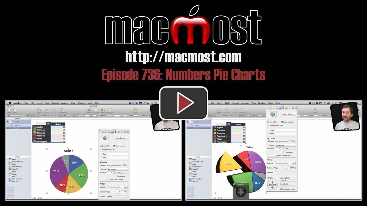
Learn how to create pie charts in iWork Numbers. You can create beautiful 2D and 3D pie charts from a simple list of numbers. Find out how to break single wedges out of the chart and how to put the chart on a separate page for printing.
▶ You can also watch this video at YouTube.
▶
▶ Watch more videos about related subjects: Numbers (210 videos).
▶
▶ Watch more videos about related subjects: Numbers (210 videos).


Hi Gary,
Great tutorials but i really miss some of the ipad numbers, how to work with pie charts and how to edit data, colors etc. like in mac.
Thanks for considering
Joe ( Switzerland)
Hi Gary... Is there a way to turn off the default drop shadow on the value label number in pie charts? Thanks!
Marc
Not sure. I don't see a setting.
Creating a pie chart or using the supplied "stock" format is not a problem. My question is how do I update the chart's legend with a new entry and new color choice?
Select the chart and use the Inspector to change which cells it represents.
Thank you the quick response. I have tried selecting the chart itself, when I do this the box containing "Account Categories becomes highlighted showing its entries & the color it represents in the chart. Any attempts to ADD a new category has been futile. Inspector works as you stated, but that's not what I need. How do I "add" a new entry into the category table AND give it a differtn color representation? Thanks
Try this. Double-click on the chart. It should also highlight the cells in the table that are being used in the chart. You can grab the bottom right corner of that area and expand it, adding more rows.