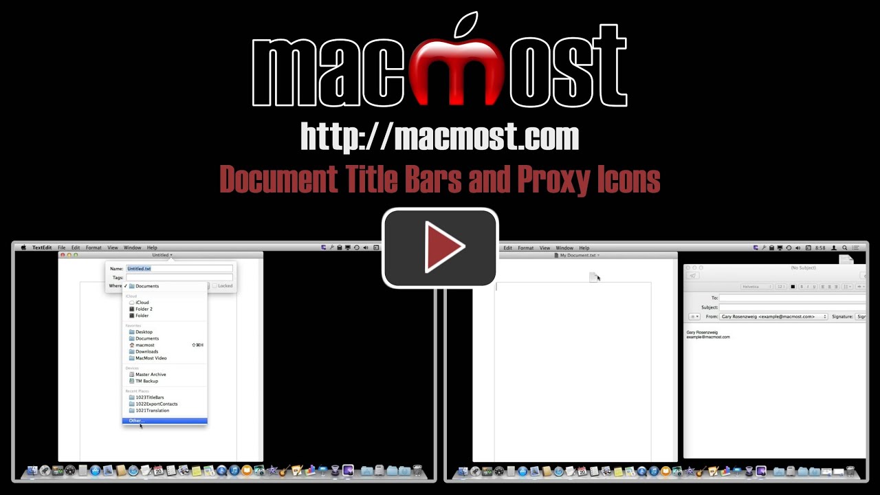
There are many things you can do in the title bar of a document window. You can rename and even move a file without ever having to switch to the Finder. You can also view the folder path to see the location of the file. With the proxy icon you can attach the file to an email or open a copy in another application.
▶ You can also watch this video at YouTube.
▶
▶ Watch more videos about related subjects: Finder (336 videos).
▶
▶ Watch more videos about related subjects: Finder (336 videos).


I'm new to OS X 10.9. In 10.6, a document that was being edited (not saved) showed a dot in the middle of the red button in the upper left. MS Word still works that way. Why was it changed? I liked it when things were consistent between text writing programs. Thanks.
My guess is that it was changed to make it clearer. The word "Edited" in the title bar is a lot clearer than a dot. Third-party developers are free to have their own design, so maybe that is why they stuck with the dot. Though looking at Word 2011, I don't see a dot, but the icon in the title bar changes brightness when a document has been edited and not saved.
Things do change. Apple products now show the "edited" comment in the Title bar instead of the often overlooked tiny dot in the Close button. Keep your eye on updates to MS products - you may find the same change there some day.
It's a mistake to want to keep things the same from release to release. If that happened, there would be no new release except for bug fixes and security enhancements. And many people are always submitting feature requests that do change how things look and behave.
New features are welcome, but as a long-time Apple user, I like the conciseness of the dot to signify an unsaved doc. I also don't like the new "Tags" feature, preferring the older "Labels" convention. In column view, I frequently have to scroll over to see the tag "dot", whereas Labels had the advantage of coloring the icon the color of the Label. A better way would be for Apple to allow users to keep what their are used to and like. Change for its own sake is not necessarily a good thing.