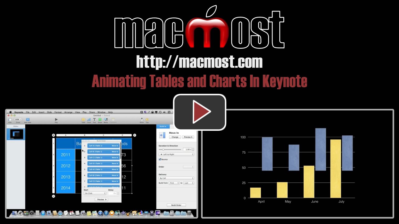
In addition to being able to create interesting transitions between slides and other elements, you can also alter the way table cells and pieces of charts appear in Keynote. You can set each piece to appear one-by-one using a variety of animations. You can also group them together to emphasize one or more pieces of information.
You can also watch this video at YouTube.
Watch more videos about related subjects: Keynote (144 videos).
You can also watch this video at YouTube.
Watch more videos about related subjects: Keynote (144 videos).
Video Transcript
Hi, this is Gary with MacMost.com. Let's take a look at animating Tables and Charts in Keynote.
So you can animate between slides and between elements as elements appear on the screen in Keynote. You can do that with just about anything including Tables.
For instance I've created a simple table here just by hitting the Table button and filling in some sample data. If I hit Play it will appear just all at once just as you would expect.
But we can change how this appears. By selecting the Table, which I have already here, I can click Animate in the Toolbar and add an Effect. You can see I am going to do this on Build In. I'm going to change how it appears.
So I can have it, for instance, do a simple Move In. You can see it do that. Now the entire table will move in, it will wait for me to do an action. I'll press the spacebar and it moves in. So that is just a little bit better than just appearing. But we can do even better than that.
What will be better is if we had individual elements of the table appear one at a time and we can animate those. So what I'm going to do here is I'm going to change the delivery from All at Once. I can do various things. For instance by row. If I were to do that I can hit the Preview button and you can see I can have each row appear like that.
I can do by each cell and each one is going to appear. Let's speed things up a little bit and do a half a second and you can see each cell appears there. There is a lot of different options and different things that you can do. For instance, a lot of these have reverses. You can do by row content or cell content. So cell content basically says put the chart in there first and then the contents appear. I'm doing it in reverse here.
What you can do is you can have the cells that are grouped together or you can start at a certain area. For instance, I can do delivery by cell and have it build only starting from the fifth one. So it will do the first four right away and then each one after that as a press the spacebar.
I can also decide to change the build order which means that not only can I move things around, shift things in here so that I can have it appear in different ways, but I can group things together and then have them appear and I can change this one to appear immediately after the first build rather than on click. Then I can do that with others. I can change between On Click and After Build and even Delay After Build. So I can really customize how these things come in to make my presentation exactly like I want it.
So you can also do this with Charts. I'll click Charts here and it will just create a sample chart for me. I'll just use this data that is in here. I can also go to Animate/Add an Effect and add any kind of effect that I want. So, for instance, I'll do Drift and Scale. So you can see how it does that for each one.
Let's create something a little more appropriate by using the Change button here and let's do a Drop. So I don't want the entire thing to drop at once. But instead I can go By Series, By Set, By Elements in Series. Anyway I want. So let's do by Series and then we will Preview this. I'll hit the spacebar and you can see the background drops first and then that, and then that.
You can do the same thing there with starting to build the different points or changing the Build Order if you want to further customize how this looks.
So you might typically want to do, very quickly, with a table like this is actually change it to By Element in Set, so each element is going to be different and I'm going to have it build say from the eighth to the last. So just the last element there is what is going to animate the screen. There I go. I could be giving my presentation and say well guess how sales were in July. I have that one drop in and then the next one drop in like that.
You could do these with any kind of chart although some work better than others. Bar graphs work really good. Pie charts aren't too bad. We've got the ability here to not only have built-ins for these but also you can find you can do build-outs as well. So you can have an effect for it to leave. So we can do Move Out and we can do that by wedge. So now we can have it go in piece by piece using one effect there and then when it is time they can all leave piece by piece. So you have that option.
You also have actions you can do in the middle. For instance, you have it do something like Bounce in the middle there and then, you know, you have a bit of an emphasis here in the middle for anything. Tables, Charts, or any other kind of animation as well. Something else to keep in mind.
Of course, when you are done these if you create something really simple, not only can you use that in a presentation but you can also export to QuickTime. So if you wanted to create something to enhance a video that you are making you can use Keynote to create an animated chart and then export it as QuickTime for a little something extra for your videos.
Gary,
Which Theme is that?
Thx
Looks like just the plain black one.