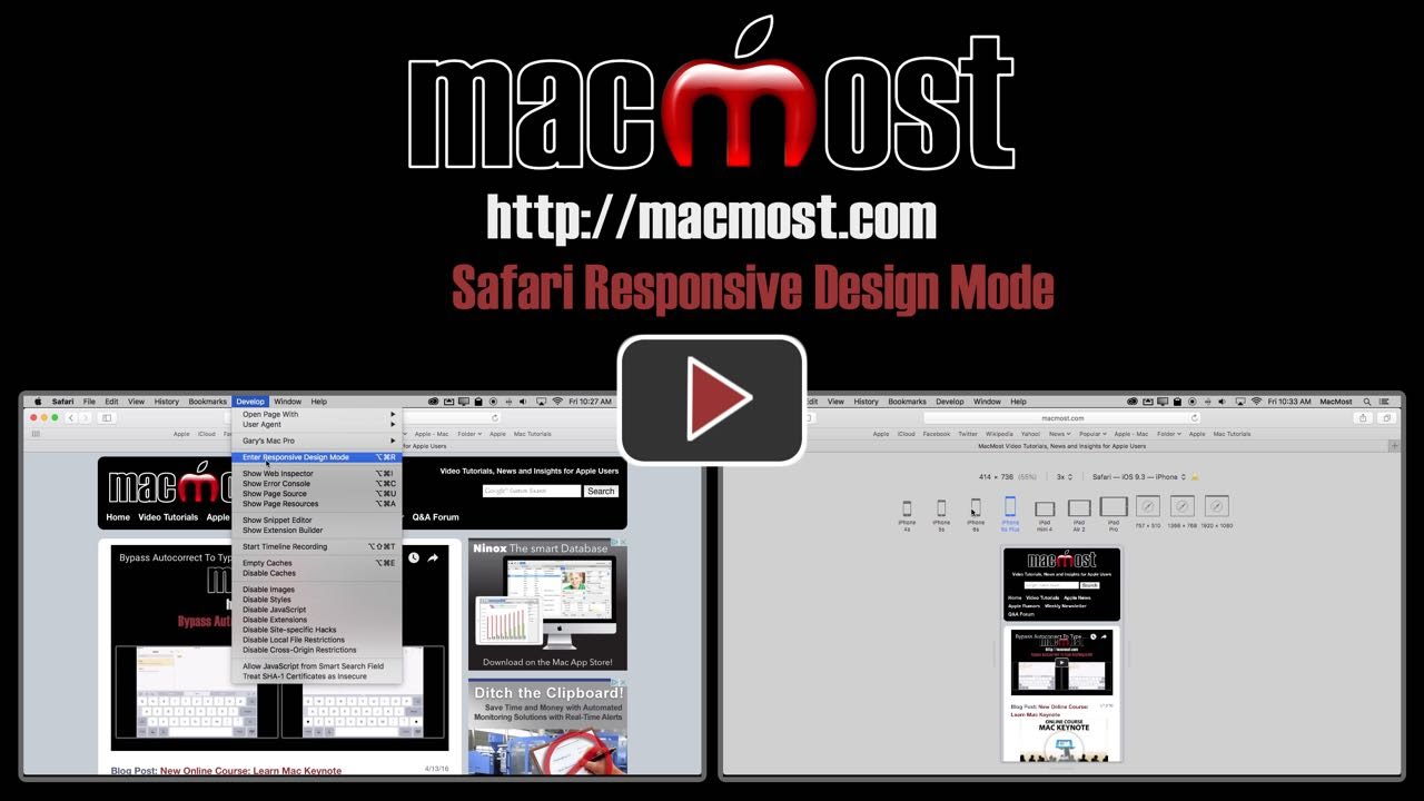
4/20/167:00 am Safari Responsive Design Mode If you have a website you should make sure it looks good on a variety of devices like phones, tablets and various computer display sizes. You can use Safari's Responsive Design Mode to preview your site at various screen sizes. You can also watch this video at YouTube (but with ads). Video Transcript: Hi, this is Gary with MacMost.com. On today's episode let's take a look at Safari's Responsive Design Mode. Now if you have a website then you want to make sure that it looks good for everybody that's viewing it whether they are on a phone, an iPad, or a computer. You've got all sorts of different screen sizes to consider. It could be very hard to test to see what it looks like. But with Safari in El Capitan it's fairly simple because you can go to Safari Preferences and turn on the Develop menu. You do that under Advanced. Show Develop Menu in Menu Bar there. Now you get the Develop Menu. Go into the Responsive Design Mode and look what you get. You get this cool display that is going to show you the pages that you are looking at. You can go to another address just like you could if you were in normal mode but it is going to show it to in a little window that is inside of a window that is mimicing the size for one of these devices. So now for instance if you want to see what it would look like on an iPhone 4S, click on the iPhone 4S and it shows it to you. You can go to all these different devices here like here is the iPad Mini, the iPad Air 2. Most of these represent screen sizes for a larger set. For instance the iPad Air 2, of course, the screen is the resolution as the iPad Air 1 and the 4th gen iPad. You can see what it looks like here. If you click another time, let's say let's go to the iPhone 6S and click on it again you can see it turns into horizontal mode. So you can go between these. The iPad Air 2 will actually switch between different screen modes like showing you the split views and turning the iPad in different directions. So you can go through all of those. In addition to that you can also set the resolution here. So the iPad Air 2 at 1X, 3X, etc., and you've got general screen sizes like this. What does it look like on an 800 x 600 window or some other sizes. Here's a big desktop size, here's a more typical laptop size, here's maybe an older computer size and you can stretch in any direction to change it here so you can see. You also have the ability to change it here at the bottom. So you can go beyond these settings to really see how responsive your design is. Now it is important to note that a lot of websites today are development responsive design which means they change depending upon the screen size. So if you go to a smaller and smaller size you can see where MacMost does this where suddenly it changes layouts completely once you go below 768 horizontally. So a couple notes about these items here. These don't actually show your webpages, what it would look like, in these browsers. Instead it is just reporting to the server. It is faking out the server telling it you're being shown in this browser in case the server is going to maybe adjust for things. So these are kind of expert modes and they are not what you think they are. If you do use them note that sometimes you get this little alert here saying you need to reload the page to tell the server that you've changed this user agent setting. But for most people just checking on your own websites, just going through all these different versions here and seeing what you get and identifying any problems and either working on them on your own or having your web developer work on them and be aware of them is very important. So this is a useful tool for anybody that has a web presence.Related Subjects: Safari (146 videos) Related Video Tutorials: 10 Design Elements You Can Use In Your Next Pages Document ― iOS 17 Standby Mode Comments: 2 Responses to “Safari Responsive Design Mode” Terry R. Schussler 9 years ago Extremely useful - thanks! RW 9 years ago Good job Gary! It's a handy tool. Thanks for introducing it to your viewers. Comments Closed.
Extremely useful - thanks!
Good job Gary! It's a handy tool. Thanks for introducing it to your viewers.