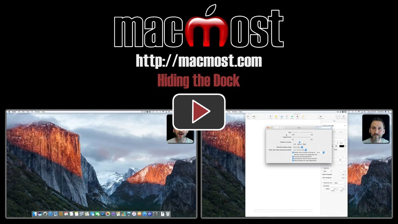
4/18/176:00 am Hiding the Dock In macOS you have the option to have the Dock always be present, or to have it automatically hide itself until the cursor is at the bottom of the screen. Both options have their advantages and disadvantages. You can also watch this video at YouTube (but with ads). Video Transcript: When using your Mac you've got a lot of control over your environment. One of the pieces of your environment that you have control over is the Dock. That is the row of icons on the bottom of your screen. You can decide whether or not you want them to always be there or whether you want them to Hide and Show automatically. I found out recently a lot of Mac users don't realize that you can control this and when they find out there's the other option they like that a lot better. So, here we see the Dock in the state where it's always there. If I move my cursor up higher on the screen it's still there. If I'm using an app, like here I am in Pages, the Dock is still there. A lot of people like this because you can always see what apps are there. You can see which ones are running because it has a dot under it and you can quickly and easily access them. But the disadvantage is that it takes up some screen space. So if I go to drag this window down you can see I can only really drag it down to the top of the Dock. If I Option click the Plus button there it hits the top of that Dock there. Now for a lot of screens this may not make much of a difference but on some smaller MacBooks that could actually be a quite a lot of screen space. So, you can change this behavior if you go to System Preferences, and you go to the Dock. You can turn on Automatically Hide and Show the Dock. Now you can see the Dock just went away but it's still there. All I need to do is move my cursor to the bottom of the screen and it pops up and appears. So I still have the same access because I can't click on those icons if my cursor is up here. So I move down to the bottom and it appears and I select which app I want to switch to. But I can also click and drag the bottom of the window all the way down to the bottom there. You can see it actually gives me a lot more space. The Dock will still appear over it but now I've got that little bit extra bit of space for that window. When I use the green button there with Option key it also takes up that space. This can be good. A lot of people like the extra screen space. They like the Dock to be hidden away until they need it. The disadvantage is that a lot of times you go to the bottom of this window to do something and instead of actually getting to do it, like I'll click down here to actually take care of something, you move a little bit too far and the Dock pops up. So it can be a little frustrating sometimes at the bottom of the screen with the cursor because the Dock's there. But the important thing is to realize that both these options are there. It's easy to use System Preferences to switch between them. You can also get to these preferences very easily in the Dock by Control clicking on the line there and you can, not only go to Preferences, but you can turn Hiding off and on. So Control click turn Hiding off and on. There are other ways to do it as well. But that's a quick way to play around with it and see if you like it one way or the other. Related Subjects: Dock (25 videos) Related Video Tutorials: 50 Mac Features Hidden Behind the Option Key ― Clean Up Your Mac’s Dock ― 10 Things You Can Do With Apps In the Dock Besides Launching Them ― Creating Handy Dock Folders With Apps Or Files